Reading Rooms
Home libraries to curl up with a good tome.
SÃO PAULO, BRAZIL
Architecture and Design: Sig Bergamin, sigbergamin.com.br
Square Feet: 360
Notable Feature: High-caliber art by Damien Hirst, Andy Warhol, Joan Miró,
and Jeff Koons
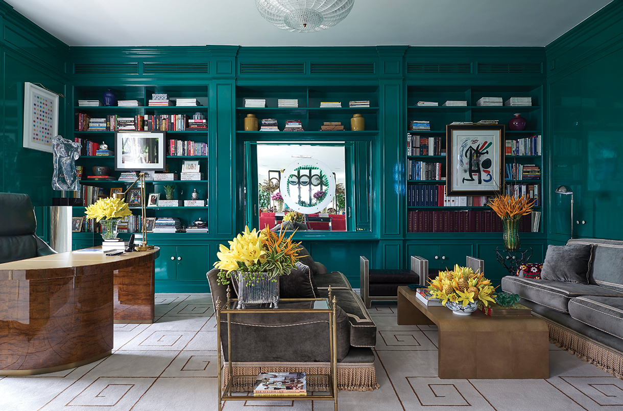
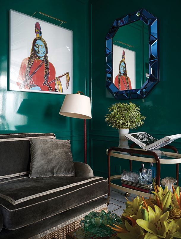
Let there be light! That was designer Sig Bergamin’s approach to this traditional library in a 1950s building. The built-in bookcases were there, but sported a dark-stained finish that felt dated. “I suggested this bold color,” says Bergamin. “It took us more than a half dozen attempts to get the right shade.” The resulting tealish-green and its light-reflecting high-gloss lacquer application instantly took the mood from sullen to sensational, as did a mesmerizing light work by French art star Noart. Bergamin updated furnishings with an eye toward modern elegance and texture. “The Art Deco desk, designed by me, is one of my favorite pieces. The wood is imbuia crespa [a species native to Brazil] and the top is camel leather.” A dyed goatskin waterfall coffee table, shagreen-covered ottomans, and a velvet-swathed sofa heighten the room’s luxe tactility. Blue-chip art and exquisite antiques (such as a modernist bar cart) ramp up the chic quotient.
LE GRAND-LUCÉ, LOIRE VALLEY, FRANCE
Architecture: Baron Jacques Pineau de Viennay (1760–64)
Design: Timothy Corrigan, timothy-corrigan.com
Square Feet: 275
Notable Feature: A 17th-century Chinese-French dictionary
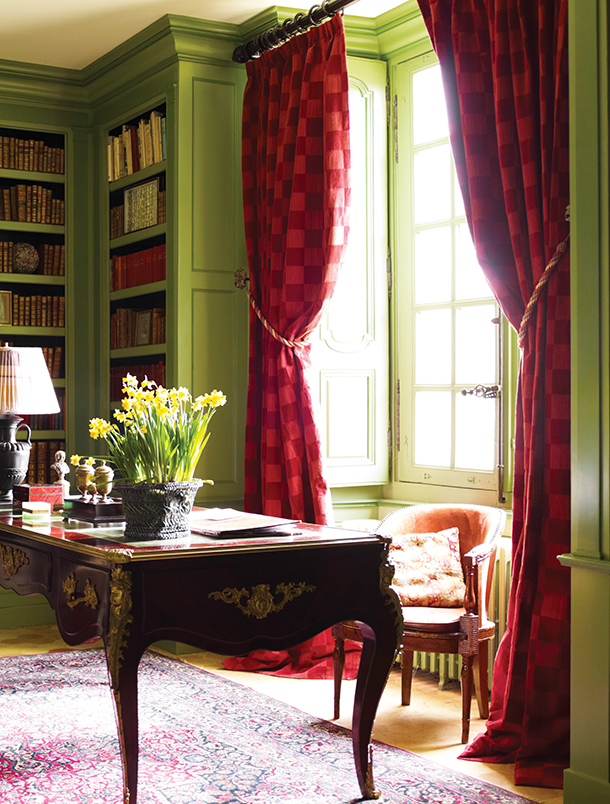
In 2004 designer Timothy Corrigan purchased this 18th-century château and sunk $10 million into its renovation (which begat a charming book, Invitation to Château du Grand-Lucé, Rizzoli, 2013). Two years ago, it was transformed into a boutique luxury hotel (chateaugrandluce.com). “I used varying shades of green throughout in order to reflect the comprehensive influence of the gardens on all of the design of the château,” says Corrigan. This library, for instance, looks onto a courtyard of boxwood topiary, hydrangea, and climbing roses. “Green is such a wonderfully contemplative color, so it seemed like the right choice for this jewel box of a room.” Raspberry cut-velvet curtains “both complement the color of the books and make the space feel warmer and cozier.” Through the renovations Corrigan added hundreds of books and an elegantly curvaceous French desk with gilded details.
NASHVILLE, TENNESSEE
Architecture: Wills Company, willscompany.com
Design: Brockschmidt & Coleman, brockschmidtandcoleman.com
Square Feet: 380
Notable Feature: A collection of souvenir presidential busts and historical memorabilia
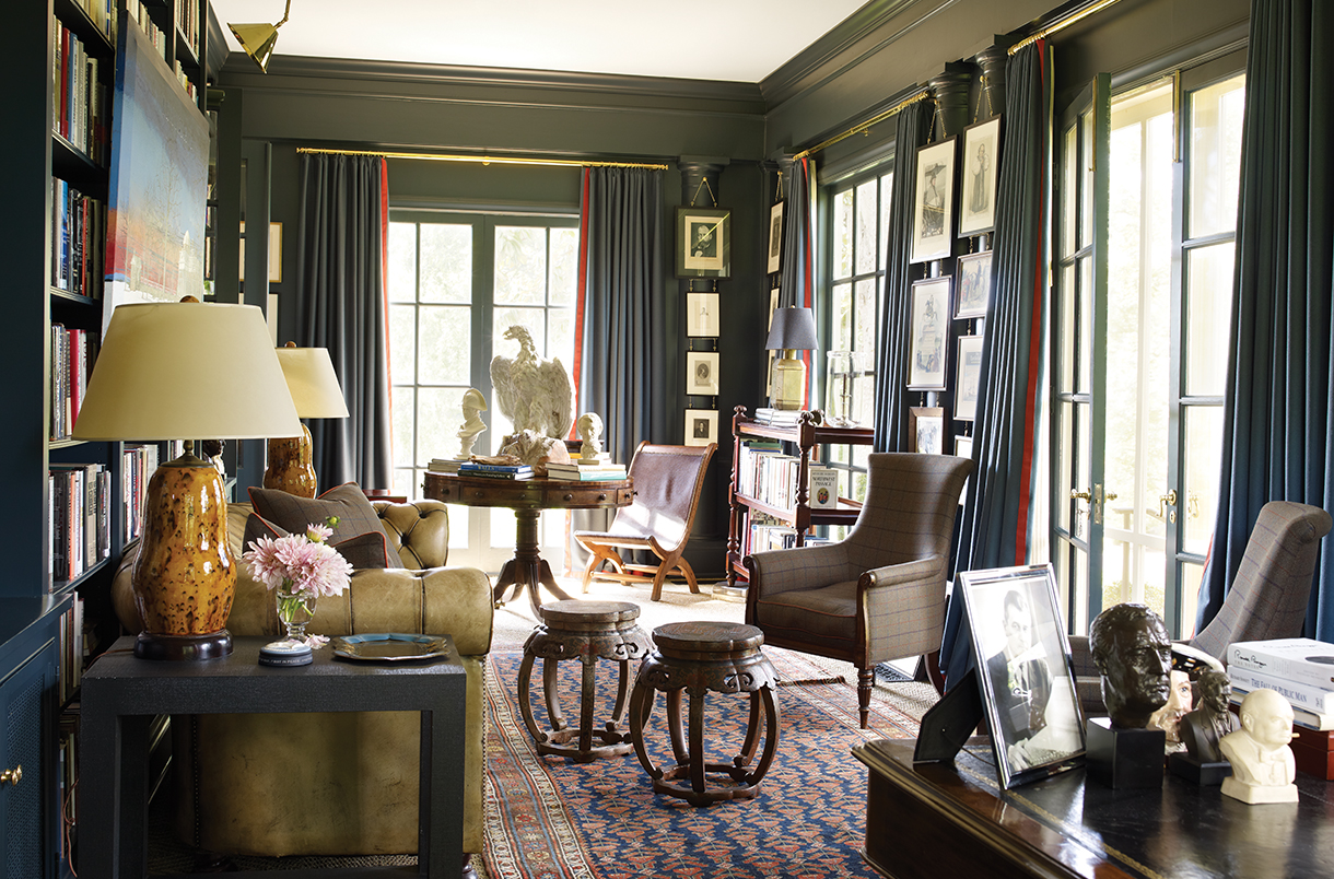
It’s logical that a presidential historian would respect classicism and tradition. Jon Meacham—chronicler of Thomas Jefferson, Andrew Jackson (for which he won a Pulitzer), and George H. W. Bush—certainly does. He relied on his designers Bill Brockschmidt and Courtney Coleman to ensure his traditional home functioned in a modern way. Says Brockschmidt, “You think of a library as an intimate, rich space, and a sun porch as light and airy.” So, adds Coleman, “We knitted the two together.” The result, she continues, “is a kind of Napoleonic campaign style.” Ergo, pictures hang on brass chains as they might in a tent, and the furniture is easily transportable, such as a Campeche chair (this one, unearthed in New Orleans, ties nicely to Jefferson, who kept one at Monticello). “Antiques are used for patina,” notes Brockschmidt. The Parsons end tables and Chinese occasional tables tucked in among seating arrangements are thoroughly 20th-century ideas.
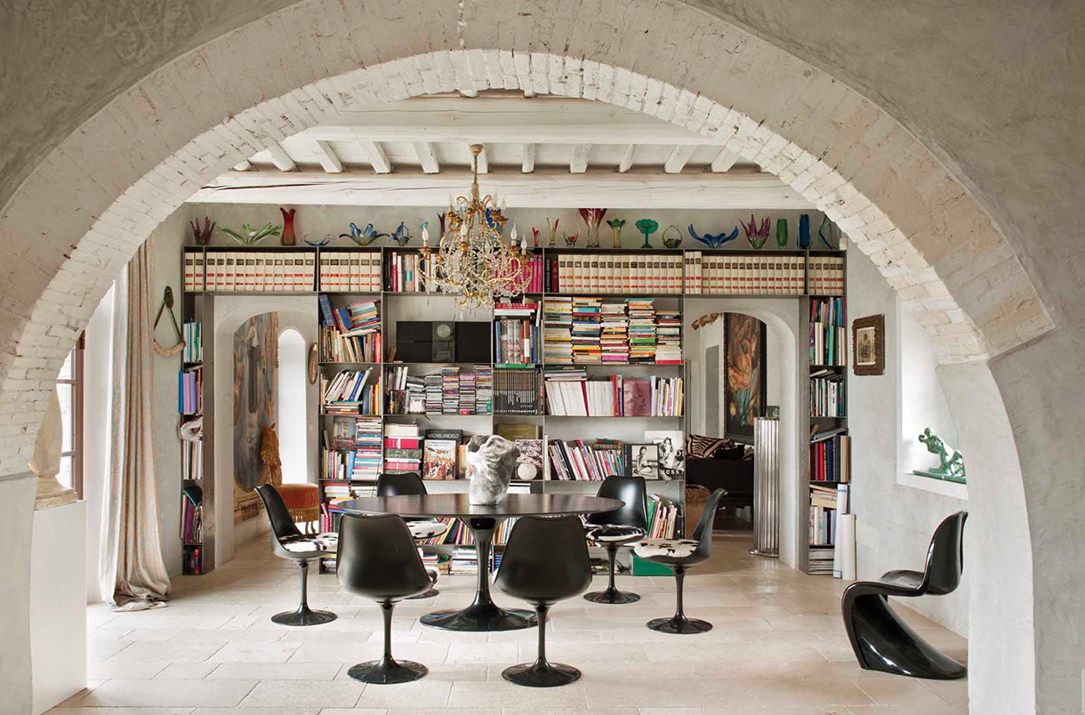
TUSCANY, ITALY
Architecture and Design: B-Arch Architettura, b-arch.it
Square Feet: 410
Notable Feature: A collection of antique Italian papier peint (decorated papers) used in religious processions
“Antique buildings have a story to tell,” says Sabrina Bignami of B-Arch Architettura. “If you ‘listen’ to this story, you can restore architecture and create interior design where the past and present live together with freedom.” The narrative Bignami and her team heard within this 19th-century farmhouse was one of family. Their response was to make the most of every room, creating mixed-use spaces in which to “share family time together.” To wit: The dining room doubles as the library. Books about art, couture, history, and culture—principal passions for the fashion-designer husband and his wife, a teacher—cram custom, raw iron shelves that cover an entire wall. “It’s a lovely room because it also opens to the garden and landscape,” she says. As such, the display anchors the open-plan home as a locus for indoor-outdoor circulation, a communal gathering spot, and a space for both socialization and contemplation.
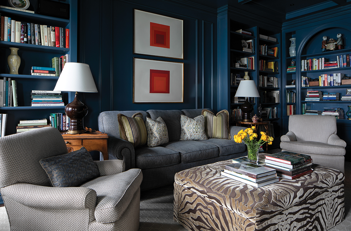
CHICAGO, ILLINOIS
Architecture: Rugo/Raff Architects, Ltd., rugoraff.com
Interior Design: Tom Stringer Design Partners, tomstringer.com
Square Feet: 325
Notable Feature: A pair of Josef Albers prints and a bronze panel by Philip and Kelvin LaVerne
Even in our glass-tower age, “Park Avenue sophistication” remains inseparable from the 1920s architecture of Rosario Candela, who defined the aesthetic. Candela was in such demand that he rarely worked outside of New York. So, to land an apartment in this Gold Coast building, his only residential building in Chicago, was a coup. Appropriate to Candela’s era, says designer Tom Stringer of the library, “The client had a large inventory of very traditional furnishings. Our goal was to very selectively interject newer objects into the mix to create a more crisp and contemporary space.” These include vibrant red prints by Josef Albers and an ottoman whose “graphic pattern is intended to move the interior along from stuffy to accessible.” And of course, a deeply saturated Prussian blue with an umber glaze subsumes the entire room in this more modern sensibility. Park Avenue sophistication meets Chi-Town, now in a 21st-century way.


