Bright Whites
The many aesthetically pleasing moods in these rooms disprove the notion that white is nothing more than the absence of color.
MIAMI, FLORIDA
Architecture: Foster + Partners, fosterandpartners.com
Interior Design: SheltonMindel, sheltonmindel.com
Square Feet: 5,500
Bedrooms: 5
Baths: 5.5
Predominant White Shade: Benjamin Moore Ultra Spec (flat) and Decorators White (ceilings); Sherwin Williams Cashmere Decorators White (walls)
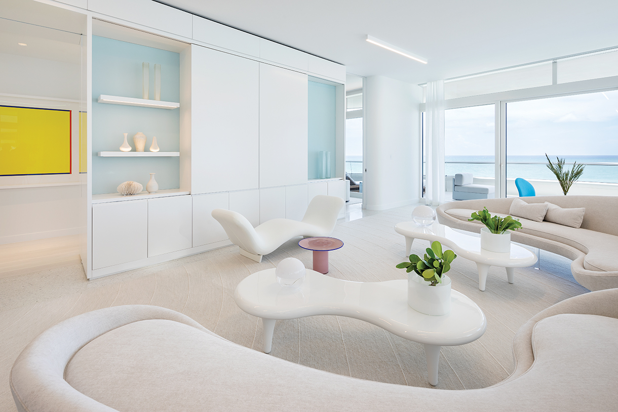
“Color is about adjacency, context, and relationships,” says designer Lee Mindel. Any white shade out of the thousands that exist must be examined for the way it relates to the setting in which it will live, as well as to colors in other rooms that are visible from that location. “This white is in harmony with sand, water, and the colors of Miami,” he says. “It interacts with all of these, creating a seamless integration of art, architecture, and context.” Part of that context is light. And white, he maintains, “is light” in the way it reflects and absorbs ambient illumination, natural or manmade. Aside from the white architectural trappings, most furniture—a 1968 Face a Face banquette by Pierre Paulin (through Ralph Pucci) and Cappellini’s biomorphic Orgone coffee tables and custom sofas—are white too. A pop of pink comes from a 1980s glass Vistosi drinks table purchased at Phillips London.
WASHINGTON, D.C.
Concept Architecture & Interior Design: Thomas Pheasant, thomaspheasant.com
Architect of Record: Overmyer Architects, overmyerarchitects.com
Square Feet: About 10,000
Bedrooms: 5
Baths: 7
Predominant White Shade: Benjamin Moore OC-117
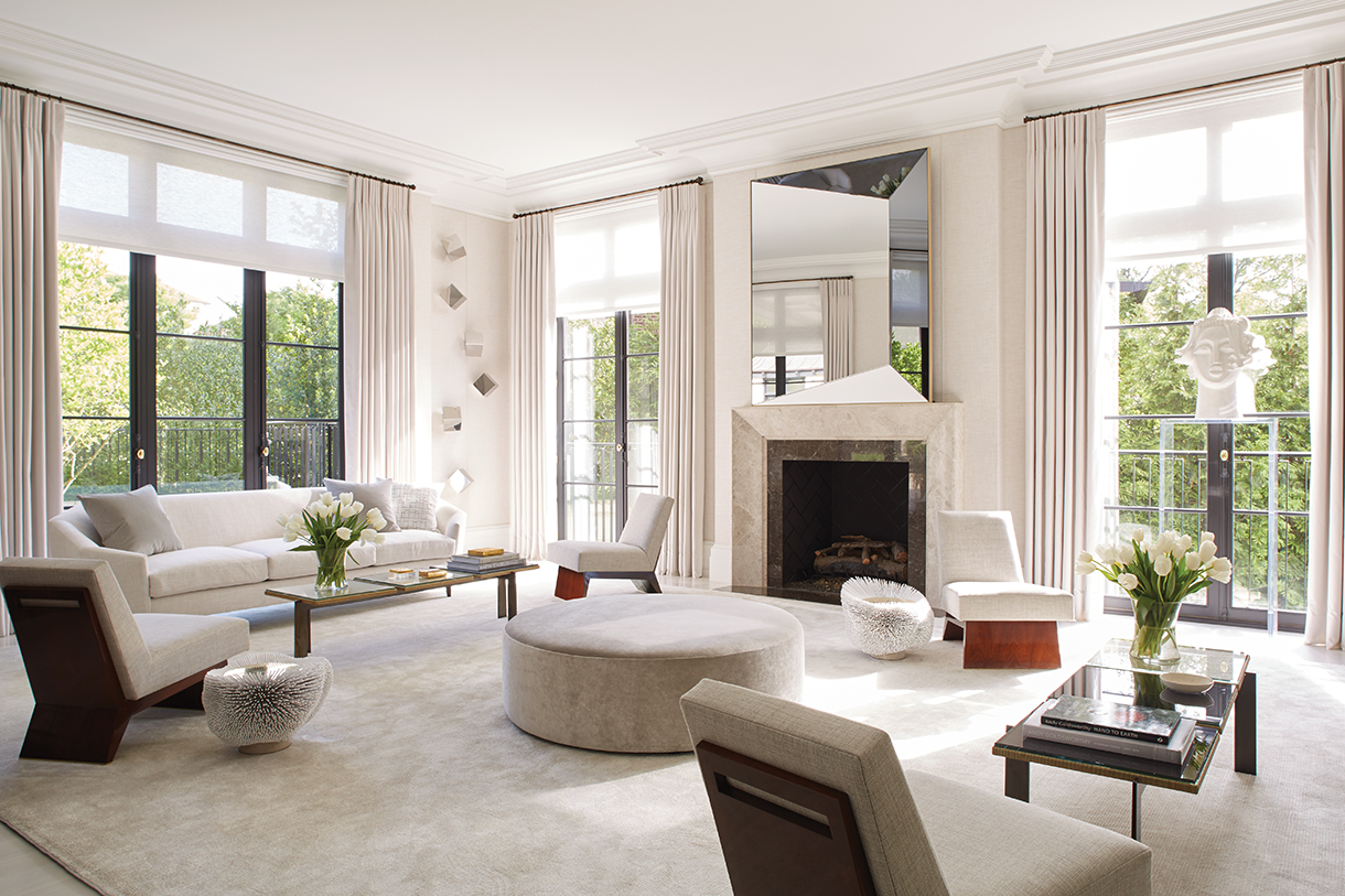
“This room is not about the white,” insists designer Thomas Pheasant of this striking living room. “The white is the vehicle to showcase forms and textures I like. This space could have been all black, all red, all blue. But white has a clean spirit.” That spirit was important for the owners, a young couple with three children. They liked the classical architecture of this house in the 1920s Foxhall neighborhood west of Georgetown, which is listed on the National Register of Historic Places. “But I wanted the house to have a bright, fresh spirit,” says Pheasant. The palette helps highlight the furniture, which is “all simple, angular, and graphic,” he says. Save for urchin-like Pia Maria Raeder tables unearthed at Galerie BSL in Paris, all pieces come from Pheasant’s own designs for Baker and his private studio collection. The relative sparseness will “allow the family to grow into the house.”
BEVERLY HILLS, CALIFORNIA
Architecture: Landry Design Group, Inc., landrydesigngroup.com
Interior Design: Magni Kalman Design, magnikalman.com
Square Feet: 12,500
Bedrooms: 6
Baths: 9
Predominant White Shade: Benjamin Moore Aura White Dove matte finish 522
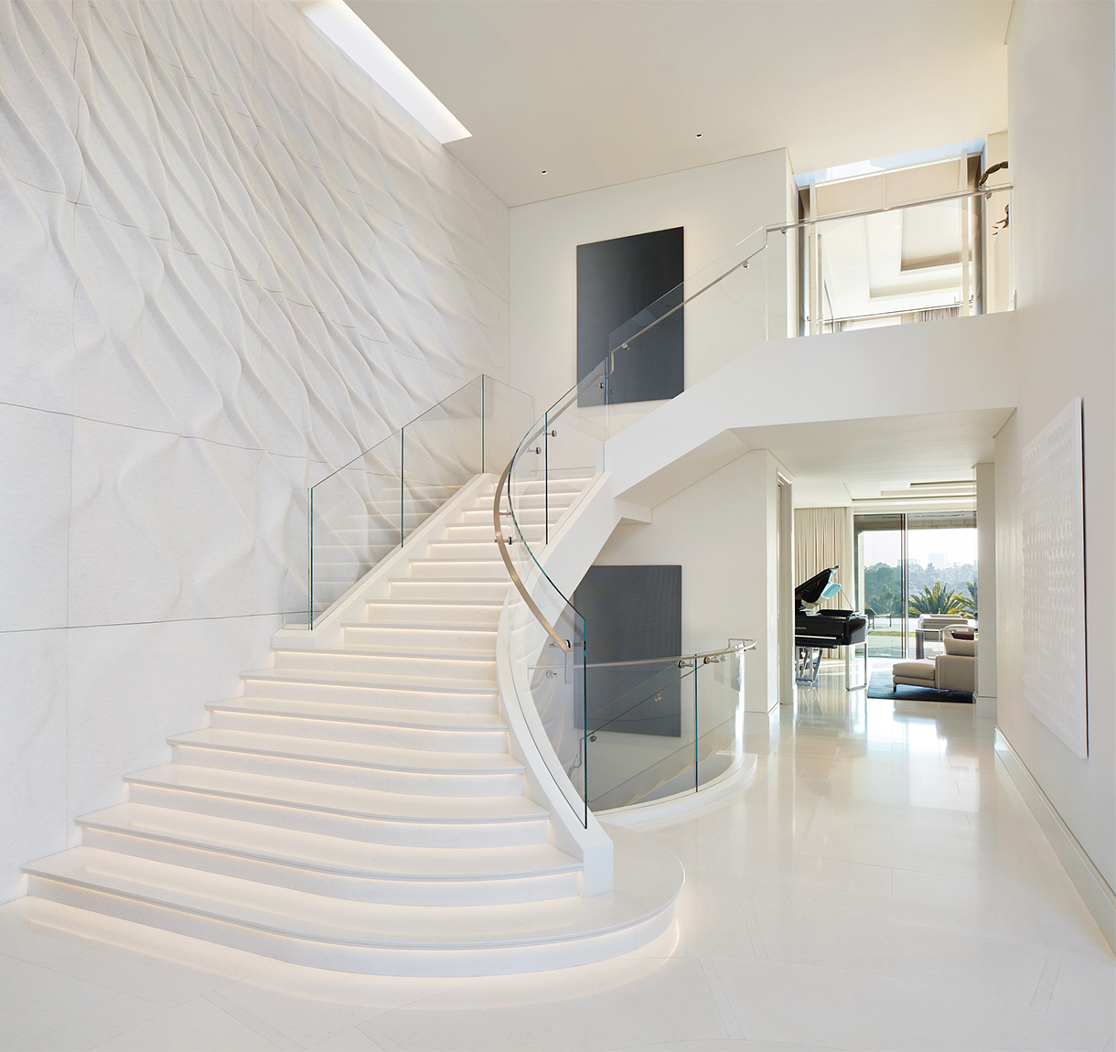
The entry hall that architect Richard Landry designed for a young family with an affinity for art and architecture features a sweeping stairway that lands in a 30-foot-tall rotunda with a base that, he says, “flares out to relate to the shape of the rotunda and the curved front and rear of the house.” James Magni, principal at Magni Kalman Design, says he and his team traveled with the clients to a quarry in Verona, Italy, to select stone for the project. There, Magni recalls, “We fell in love with a small, single panel of carved stone by Zaha Hadid. We developed the concept of featuring it as the entry wall, scaling it to fit the much larger space.” Landry observes, “It’s incredible the movement Hadid was able to create, to make something fluid out of a material that’s hard and solid.” Monochromatic artwork by Anish Kapoor, Enrico Castellani, and Roland Reiss add presence without distracting from the Hadid installation.
WIMBLEDON, LONDON
Architecture: F. Wheeler (Frederick, 1853–1931), Son and Searle
Interior Design: Katharine Pooley, katharinepooley.com
Square Feet: 10,000
Bedrooms: 5
Baths: 5
Predominant White Shade: Farrow & Ball Blackened No. 2011
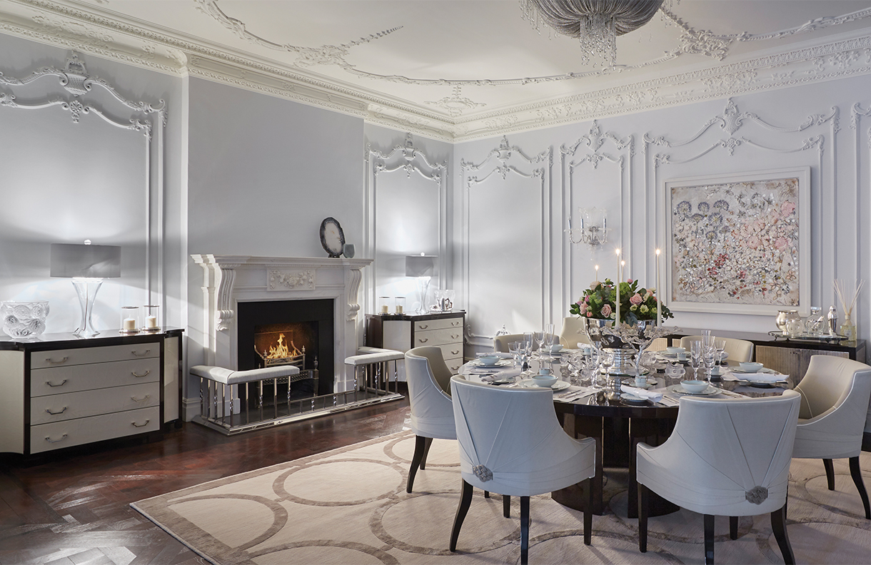
“I believe the best design should transport the viewer from the everyday and the humdrum,” says designer Katharine Pooley, “and make them feel they have entered an alternative realm of beauty, comfort, luxury, and serenity.” Existing in the dining room of this historic, early-1900s brick-and-stonework home was a section of ornate original plasterwork that Pooley restored. “Its graceful, florid lines and intricate detailing needed to be balanced with clean shapes and a light color palette,” she explains. A bespoke dark-stained wood table anchors the space, which is otherwise a symphony of delicate whites, starting with walls of Farrow & Ball’s coolest white shade in its Estate Emulsion finish, which, Pooley says, “has a beautiful soft patina.” A shimmery silk rug, crystal sconces, and couture details (chain mail clasps on chair backs) heighten the magic. “The dining room should be the most elegant of rooms, and white has a timeless elegance,” she says.
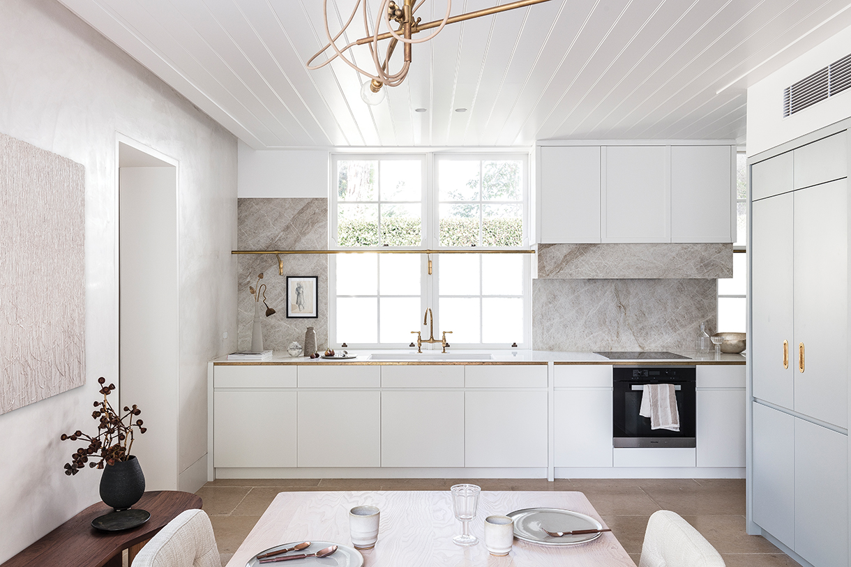
DARLING POINT, SYDNEY, AUSTRALIA
Architecture & Interior Design: Alexander & Co., alexanderand.co
Square Feet: 2,500
Bedrooms: 4
Baths: 2.5
Predominant White Shade: Porter’s Original Paints Snow White
“A house is lived in through many seasons, and many moods and minds,” says Alexander & Co. principal Jeremy Bull. “An idea of color may respond well in one instance and poorly in another … White becomes a changeable context for the pieces in a home that can more readily be altered.” For this kitchen in a Victorian cottage renovation, Bull selected “chalky whites, which were a homage to our vision for a traditional plastered house.” Within the white palette, he built in a variety of textures: beadboard on the ceiling, smooth matte white cabinetry, a grayish-white marble, an artwork featuring a surface of thick impasto, and nubby upholstery on the chairs at the kitchen table. “White is a color that needs to complement your tonal story,” he says. “It is often not a simplification from an otherwise colored palette. It is an actual color. It needs to be treated with dignity.”
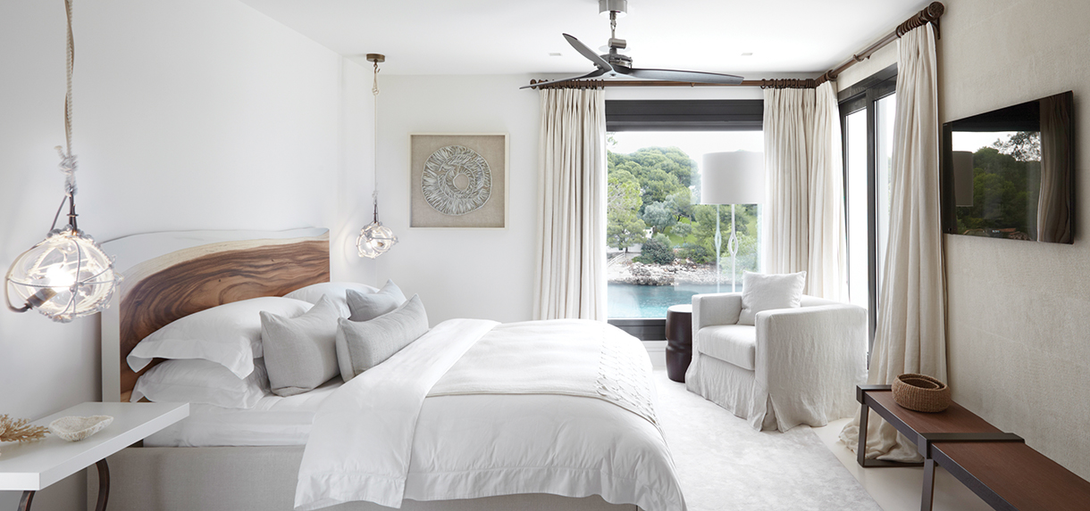
CALA D’OR, MALLORCA, SPAIN
Architecture: Local architect
Interior Design: Fiona Barratt Interiors, fionabarrattinteriors.com
Square Feet: 7,000
Bedrooms: 6
Baths: 7
Predominant White Shade: Custom-mixed Dulux color
“We wanted to keep the palette neutral throughout to maintain an airy, light feel,” says designer Fiona Barratt of this dreamy bedroom. “By keeping it neutral, the white frames the beautiful, vivid aqua blue of the ocean.” The secret to using white, believes Barratt, “is about using textures and a mixture of materials to add character, depth, and interest.” Here, that extends from the textured plaster on the wall (executed by Italian artisans) to the glossy lacquer surfaces of the custom nightstands, which contrast with the “very heavy, solid headboard, where we added a strip of white along the top as a highlight.” Texture also distinguishes the framed porcelain sculpture mounted on linen by Fenella Elms on one wall, and the Lindsey Adelman pendants flanking the bed, which combine handblown glass globes with knotted rope. The latter two elements also evoke the Mediterranean setting with references to shells and glass fishing floats.
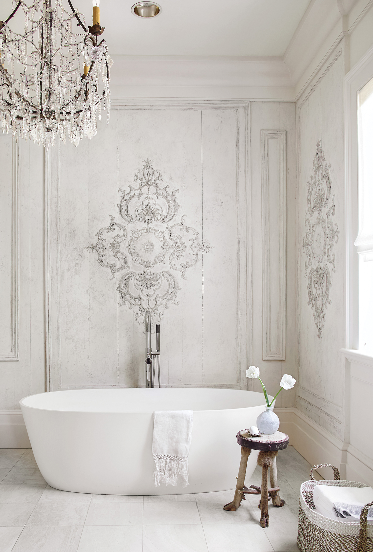
NEW ORLEANS, LOUISIANA
Architecture: The late Barry Fox
Interior Design: Tara Shaw, tarashaw.com
Square Feet: 4,800
Bedrooms: 3
Bathrooms: 4.5
Predominant White Shade: Benjamin Moore Aura 925
In the early 2000s, the Francophile nephew of prominent Louisiana politicians Hale and Lindy Boggs asked beloved New Orleans architect Barry Fox to replicate a Haussmanian home he’d encountered on one of his trips to France. Today it is inhabited, appropriately, by another Francophile: designer Tara Shaw, whose book, Soul of the Home, was recently published by Abrams. The starting point for the master bath were three Louis XV–style boiserie panels she interspersed with pine panels, unifying them all with a whitewashed finish. A Louis XVI console with “a layered 200-year-old patina you just can’t replicate” functions as a vanity for the Italian marble mortar bowl sink. The Venetian mirror and Italian chandelier are “a perfect marriage with the boiserie decoration,” she says. Modern fixtures complete the space. “People think the room is ‘just’ white, but it has more depth because it layers in the dimensionality of a gradient white palette,” says Shaw.
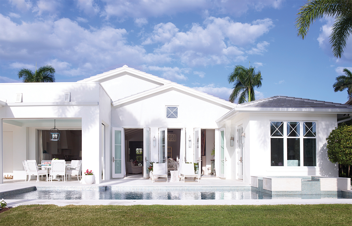
NAPLES, FLORIDA
Architecture: Herscoe Hajjar Architecture, Inc., hharch.com
Interior Design: Suzanne Kasler, suzannekasler.com
Square Feet: 5,500
Bedrooms: 4
Baths: 4.5
Predominant White Shade: 50-percent dilution of Benjamin Moore White Dove
“In our design process, we talk about how the house is going to live outside as well as inside,” says designer Suzanne Kasler. “We don’t consider the outdoors after the project is underway; it’s part of the process from the beginning.” For this Indiana couple who loves to entertain, it was especially important. The vacation bungalow Kasler revamped for them faces a waterway with generous outdoor lounging and dining areas sprawled along it. The client loves color but wanted the home to feel modern. So, Kasler deployed pink cushions and a colorful painting in the dining loggia, but kept mostly all else brilliantly white, both inside and out. “White is a signature of my work,” she says. “It brings everything into a cleaner, modern sensibility.” That extended to the outdoor furniture: Janus et Cie Amari chairs around a firepit, the company’s chaises by the pool terrace, and McKinnon and Harris dining furniture in the loggia.


